SOAPS BY KRYSTAL
Brand Identity Development
Handcrafted, Palm-Free, Eco-Conscious Soaps & More
CLIENT:
Krystak Ridgway
DATE:
2020
GIVE THEM A FOLLOW:
About the Work
Krystal came to us with the idea to build a visual representation for her growing business. She was hitting a point of massive growth and wanted to have some consistency in how her brand was represented in the marketplace.
Seeing a massive uptick in business with a ton of opportunity to explore, we wanted to represent this brand in a fashion that was clean, professional, and scalable. We wanted any elements that we created to work across a number of platforms and on a number of products regardless of their size or use.
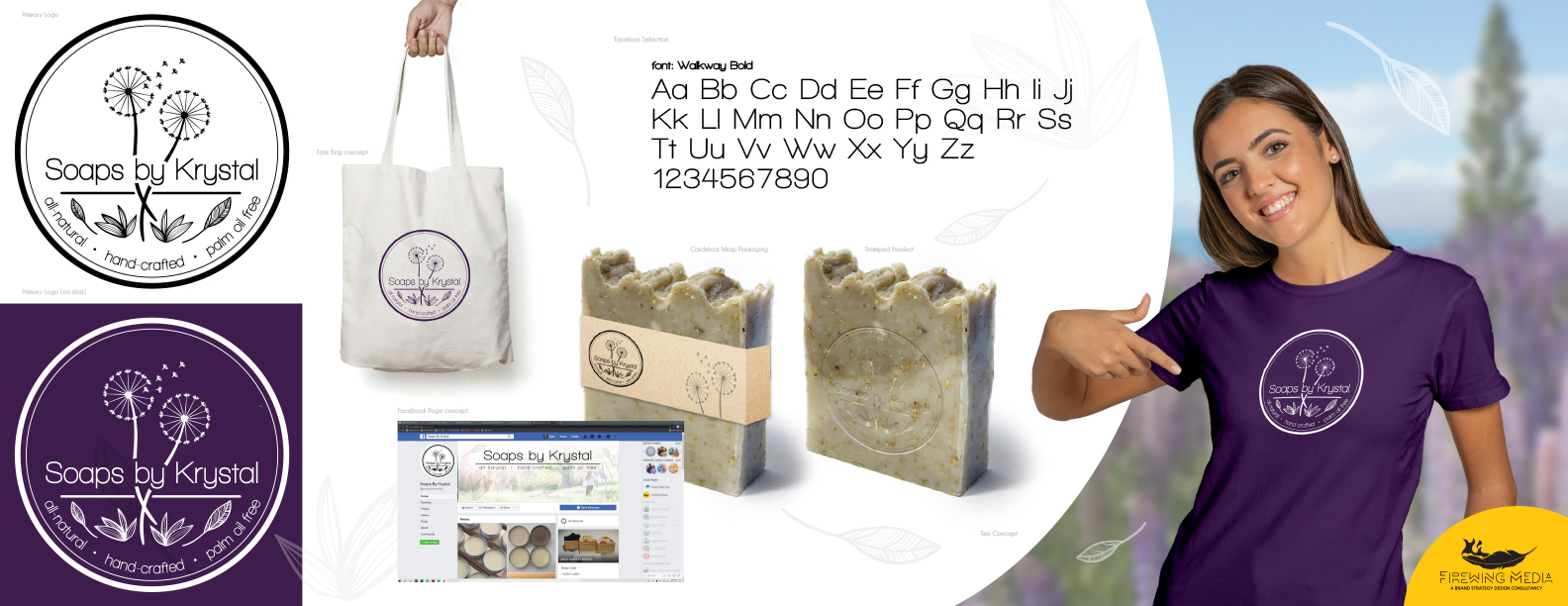
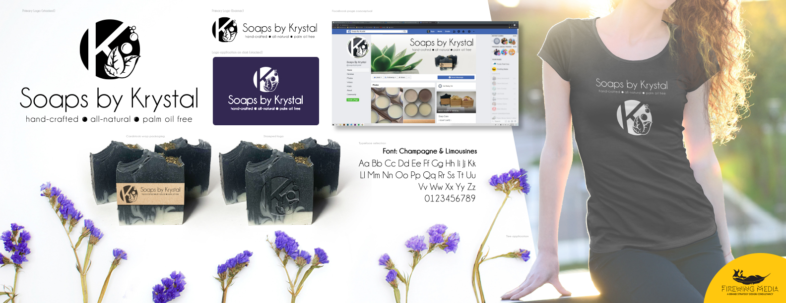
After a brief discussion we set our sights on a few different concepts and delivered a set of stylescapes, not only showcasing a logomark, but also some real-world applications.
Being able to see how your brand interacts with the real world can not only help solidify what it is you’re after, but can also help open the doors to a load of possibilities!
THE RESULT
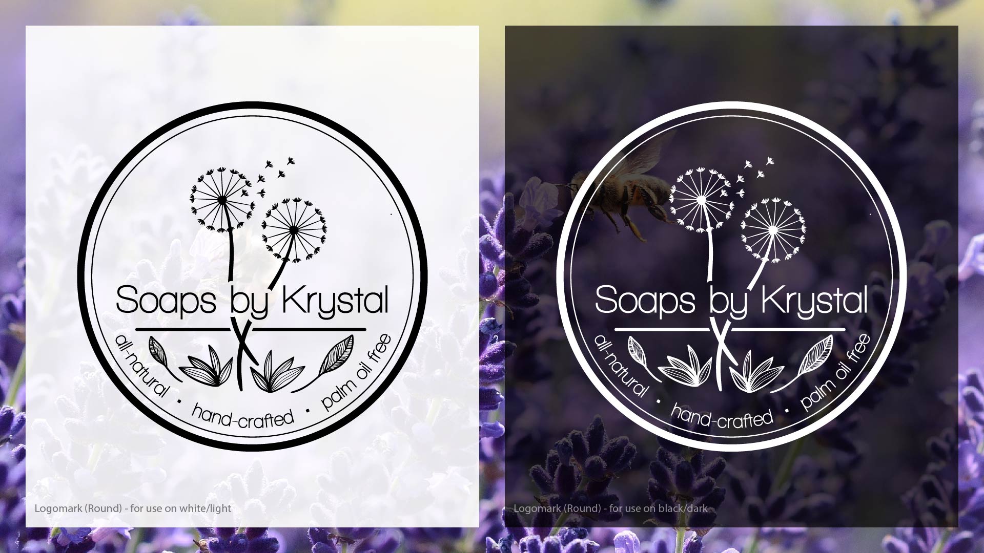
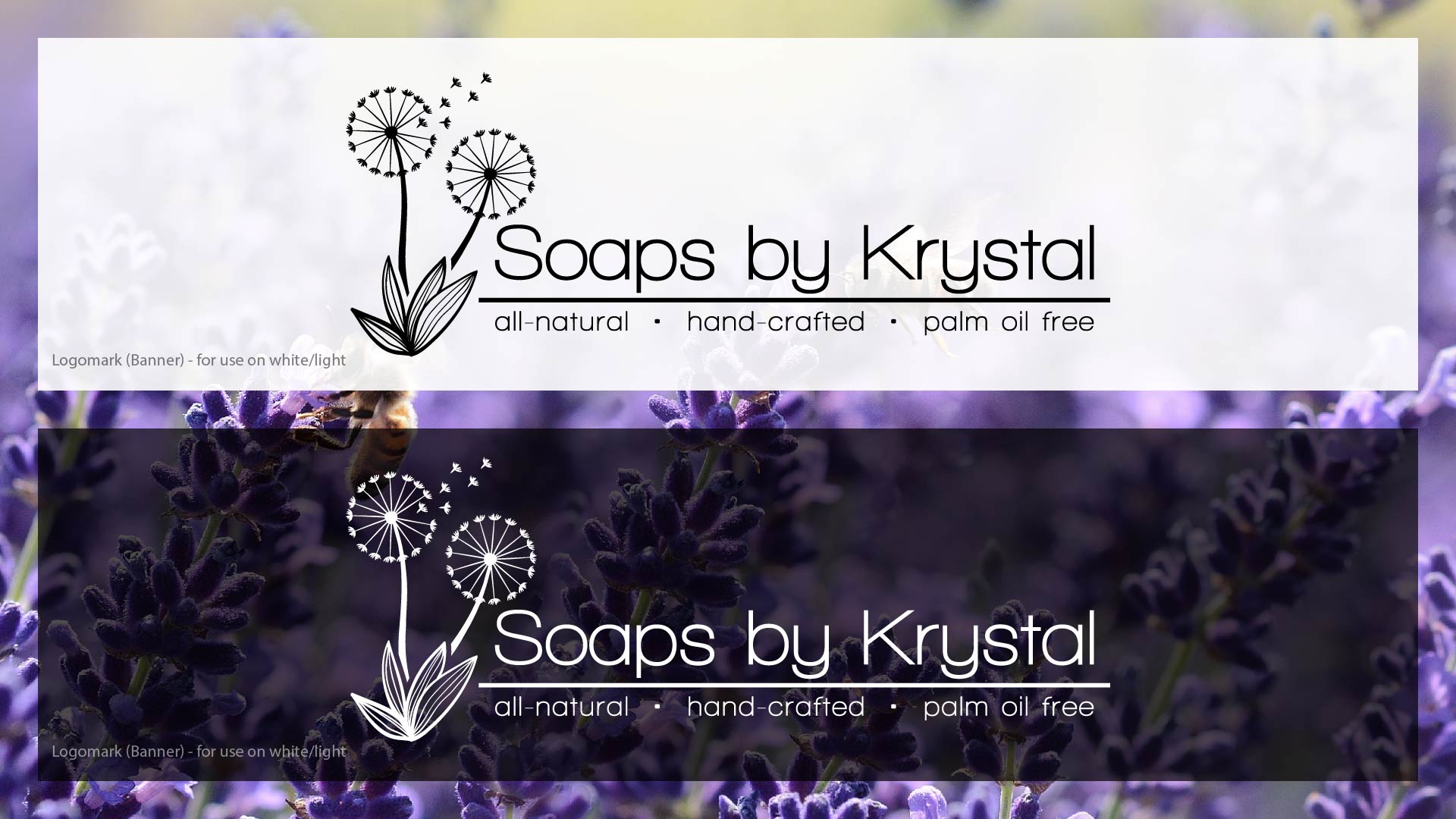
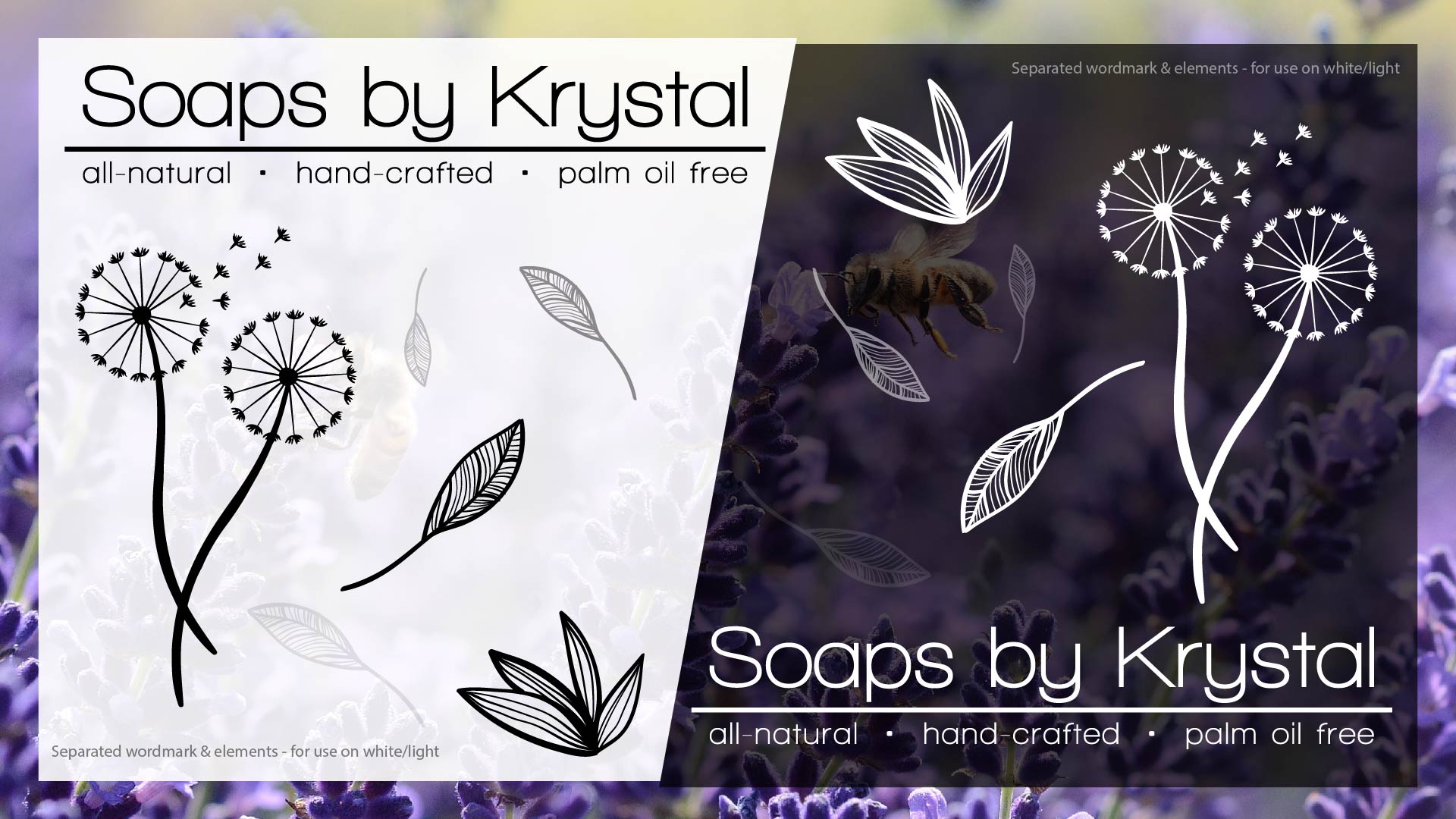
Clean lines and the absence of colour allows this brandmark to work on a number of applications across the board. We also wanted to represent the logomark as both a circular ‘stamp’ as well as a banner for added versatility, while the separated elements help marry the design on any future project! We’re happy with the result and excited to watch Krystal’s brand grow!


