FUNDY FLOAT CORP.
Complete Coverage
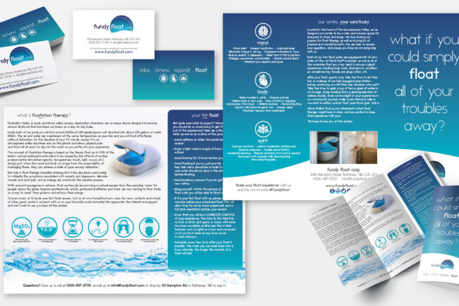
Truth be told, I (Ryan Lavigne) am also the owner of Fundy Float Corp., but I am also the primary developer of everything for the brand. It’s another accomplishment that I am super proud of and it certainly has it’s place here.
CLIENT:
Myself (Ryan Lavigne)
DATE:
2018 - Present
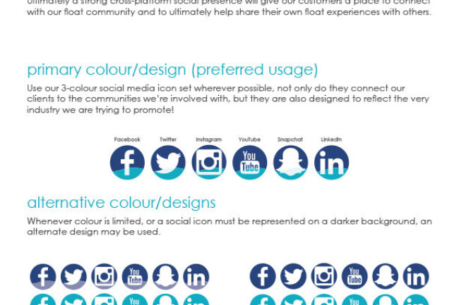
GIVE US A FOLLOW:
A Statement Regarding This Work
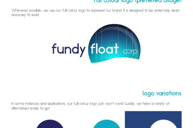
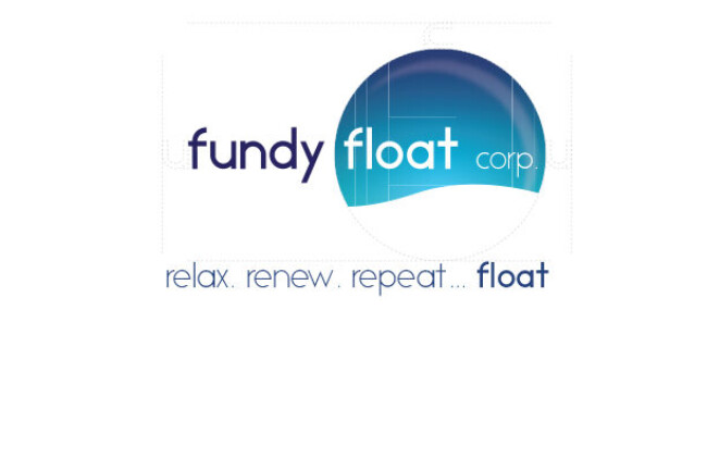
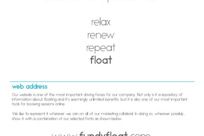
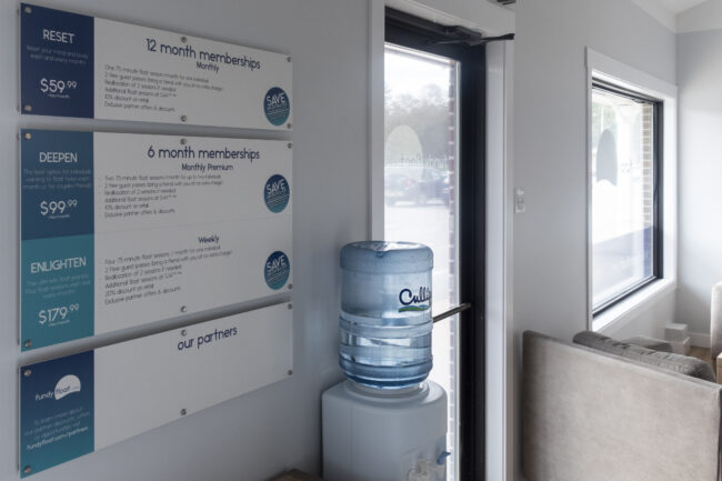
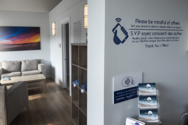
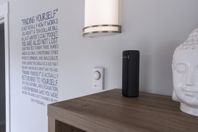
Being the proud owner gave me carte blanch with regards to design. It’s always been about marrying the simplicity of float therapy with a clean and minimal design.
As Fundy Float has grown over the past few years, the design has evolved a bit, but all falls back onto the foundation we built in day one.
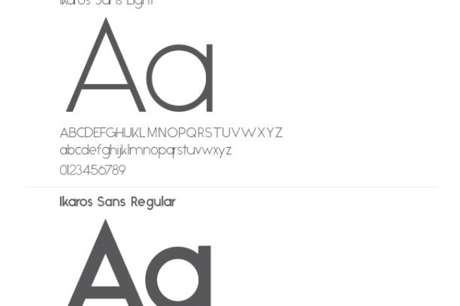
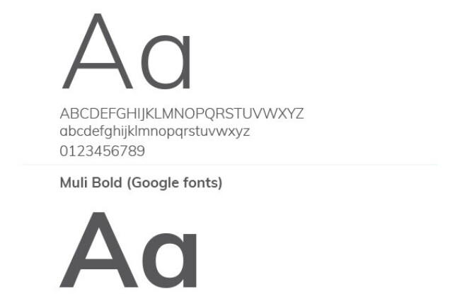
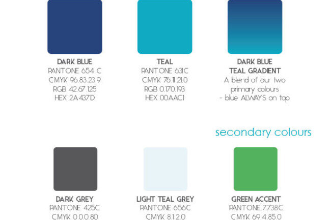
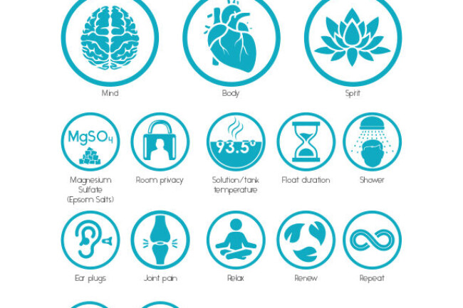
Having a business specializing in cutting out the noise in life, I wanted a brand that represented itself with simplicity – no crazy typefaces, no super complicated graphics. I wanted clean lines with a simple colour palette to represent the business as well as to tie into the overall aesthetic of our flagship location in Rothesay, NB.


