BEARDS BEERS
Brand Identity Development
Beards Beers is the home of the greatest beer being tapped.
Reviews and enough images to make you thirsty, we were thrilled to work with this local content creator!
CLIENT:
Keith Stevenson
DATE:
February, 2021
GIVE THEM A FOLLOW:
Client Brief
When Keith first approached us with the concept for his beer review profile, he was looking for something with hops representing a full beard. He had only seen a few things that he had liked online but felt that most of the imagery leaned too far into the ‘hipster’ vibe. We had ‘carte-blanche’ to run the idea and landed on something that we’re all very proud of.
Our Approach
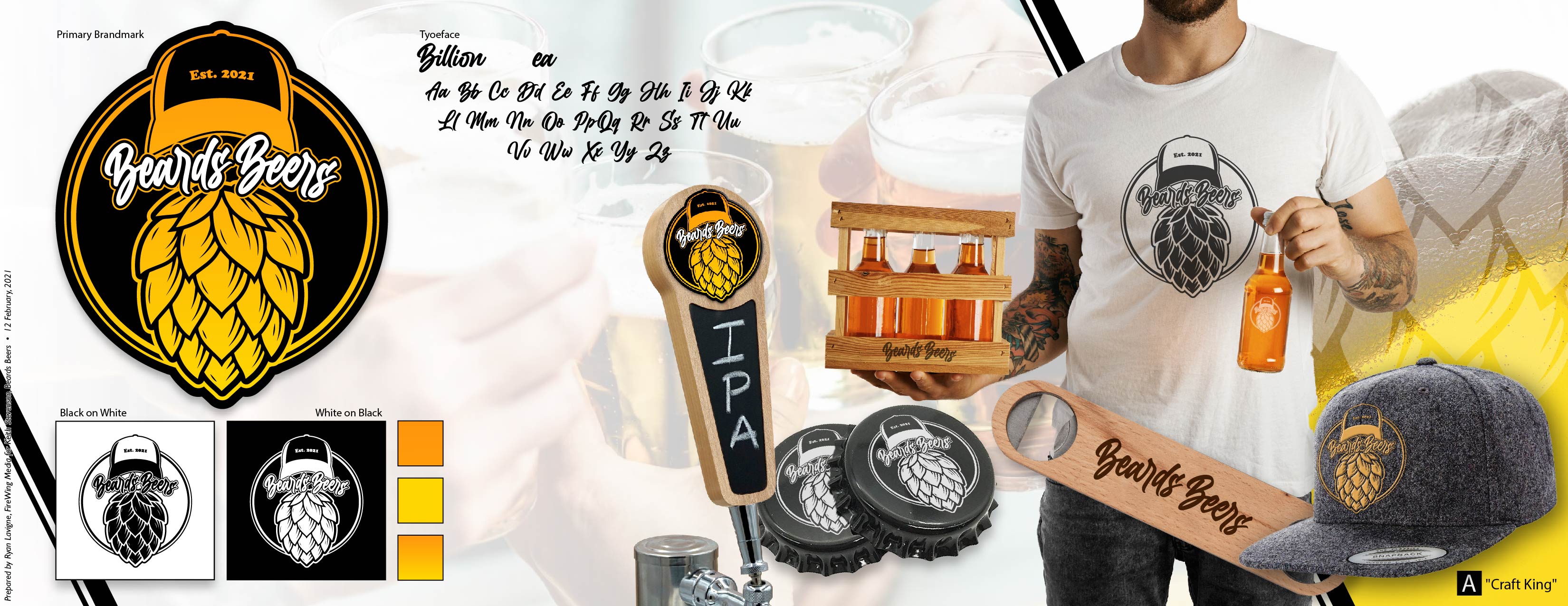
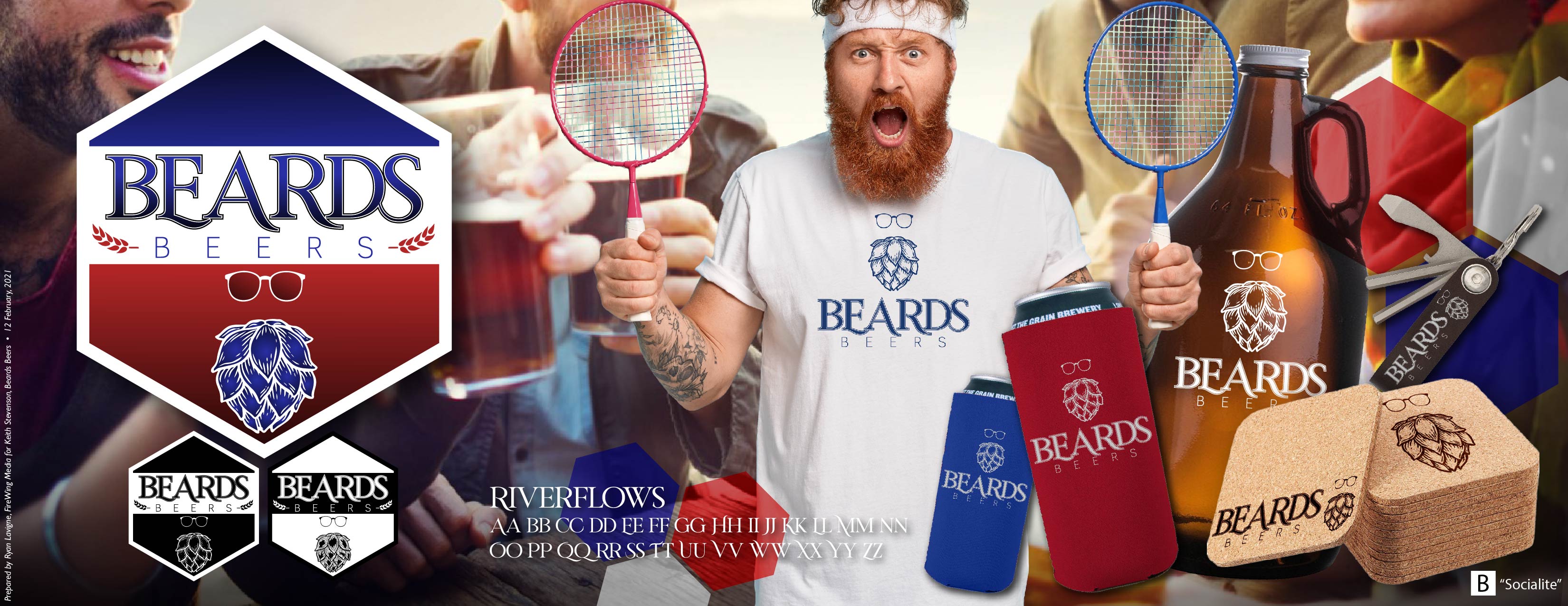
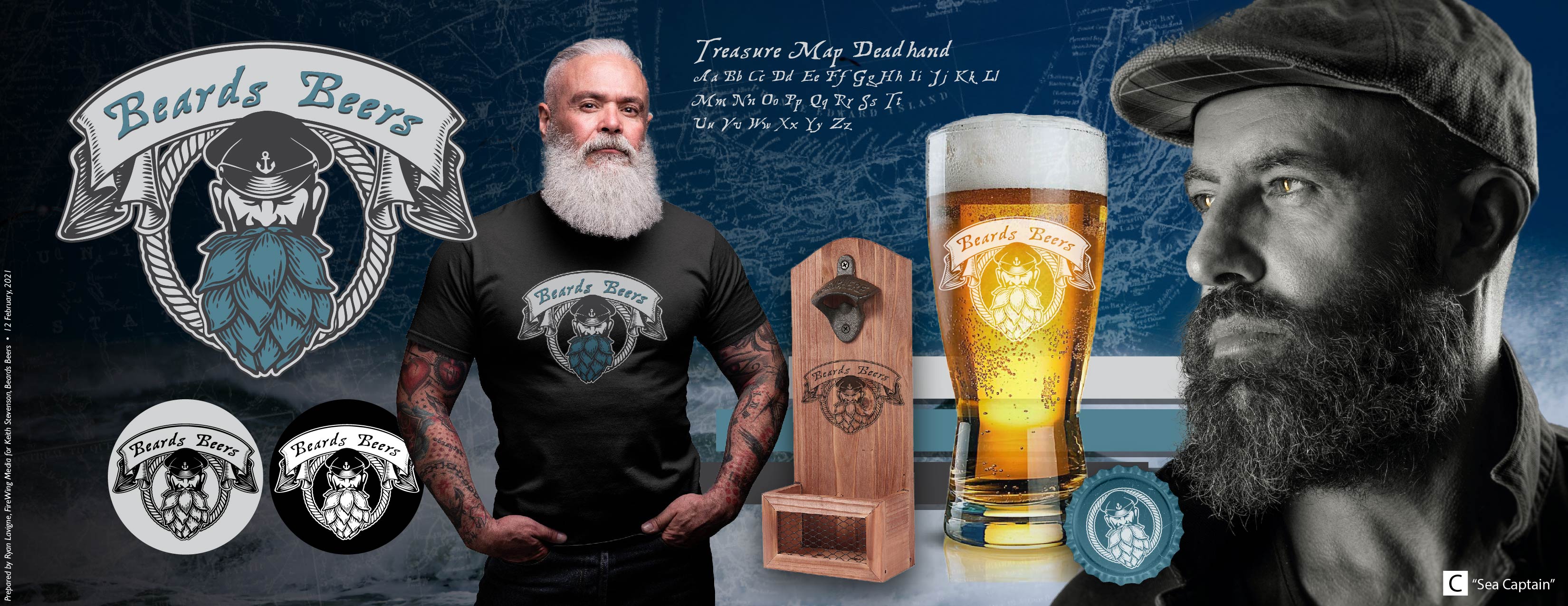
Even though this was a relatively small project it still got hit it with the same approach we would use for a monster of a brand! Starting with a few brand-mark concepts we developed ‘stylescapes‘ to see how the brand concept could be represented in real-world applications with plenty of room to grow.
Given that we are living in the Maritimes on the eastern coast of Canada, an old sea captain hit the mark, stayed as far from ‘hipster’ as possible and paid tribute to our Maritime heritage
The Result
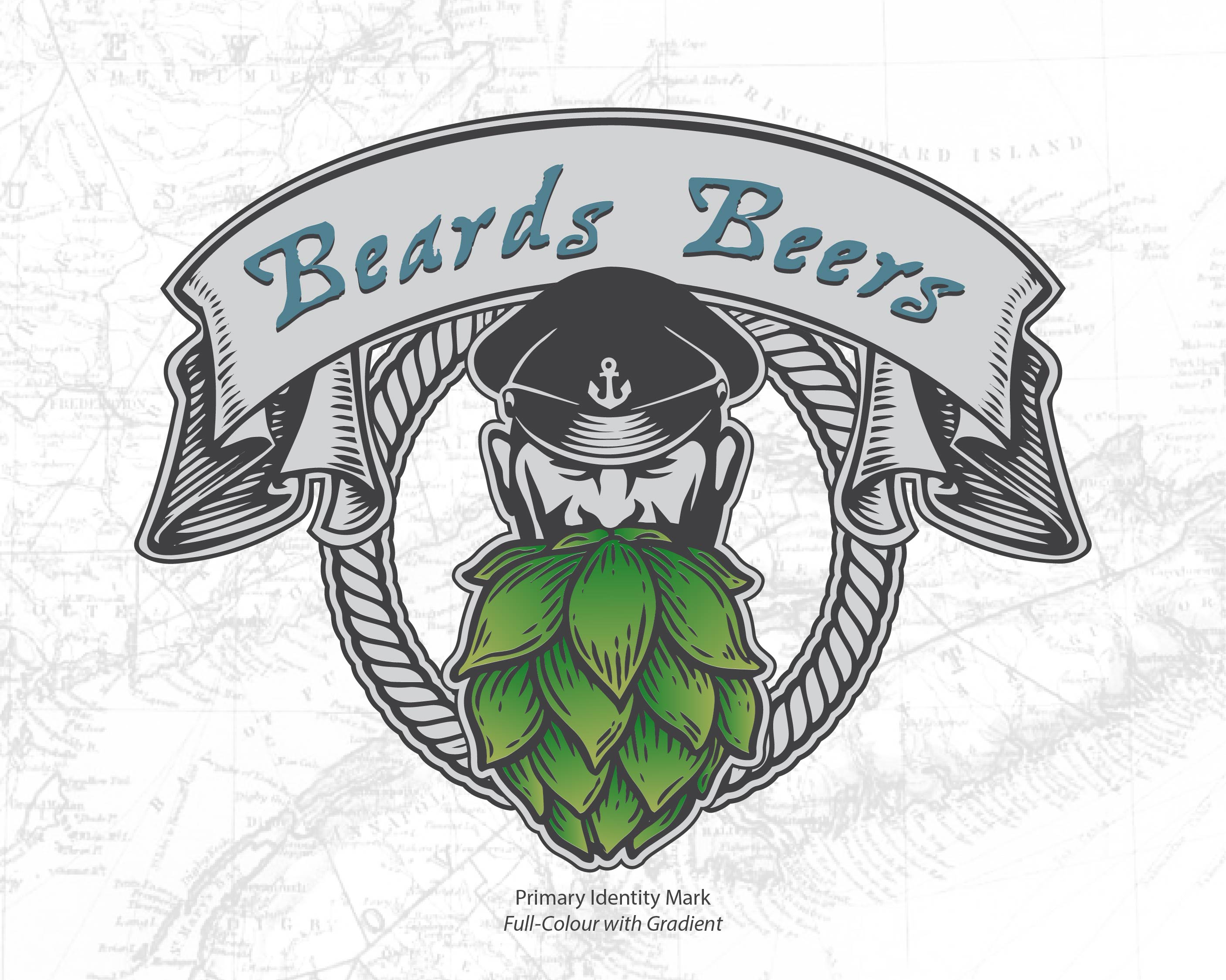
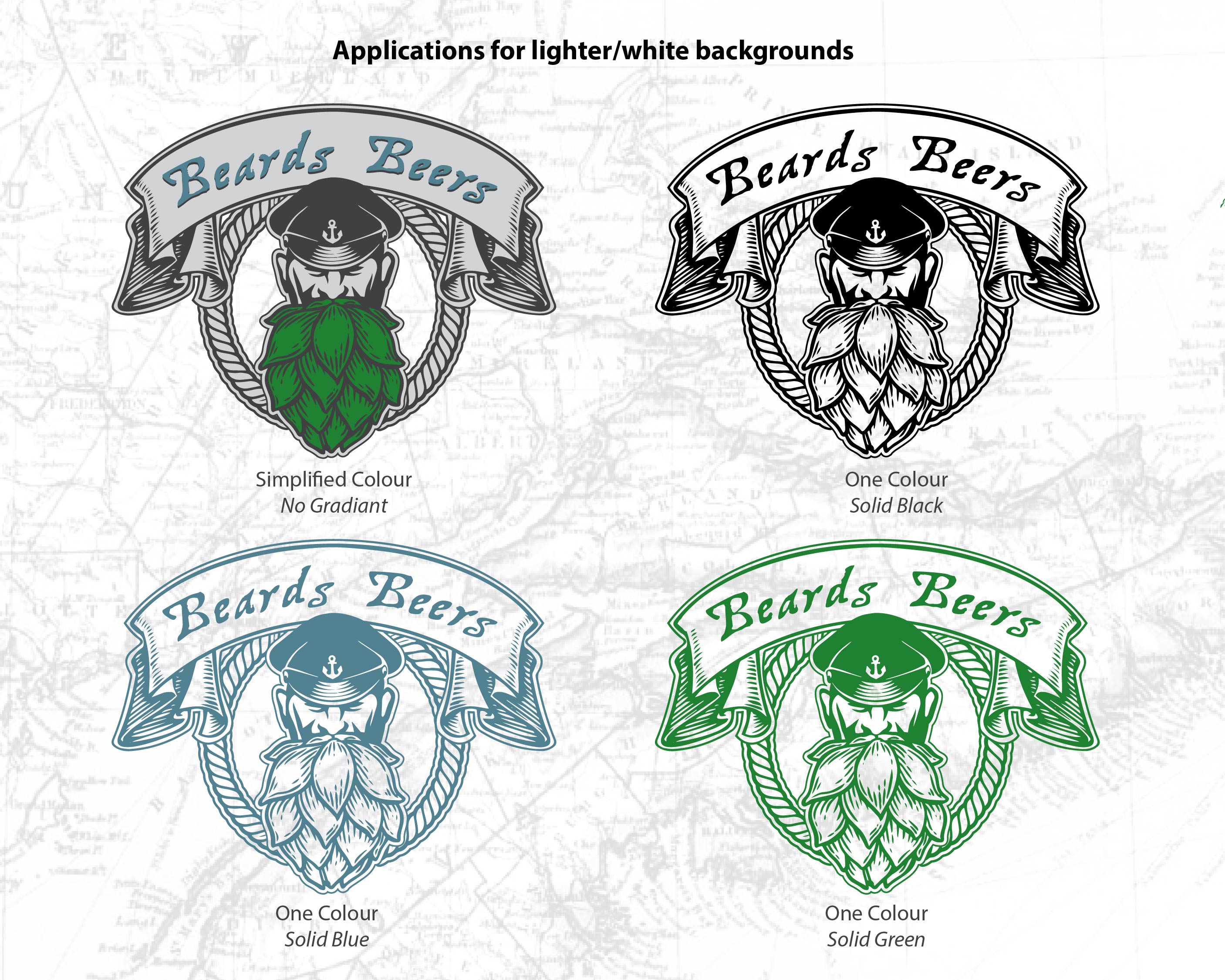
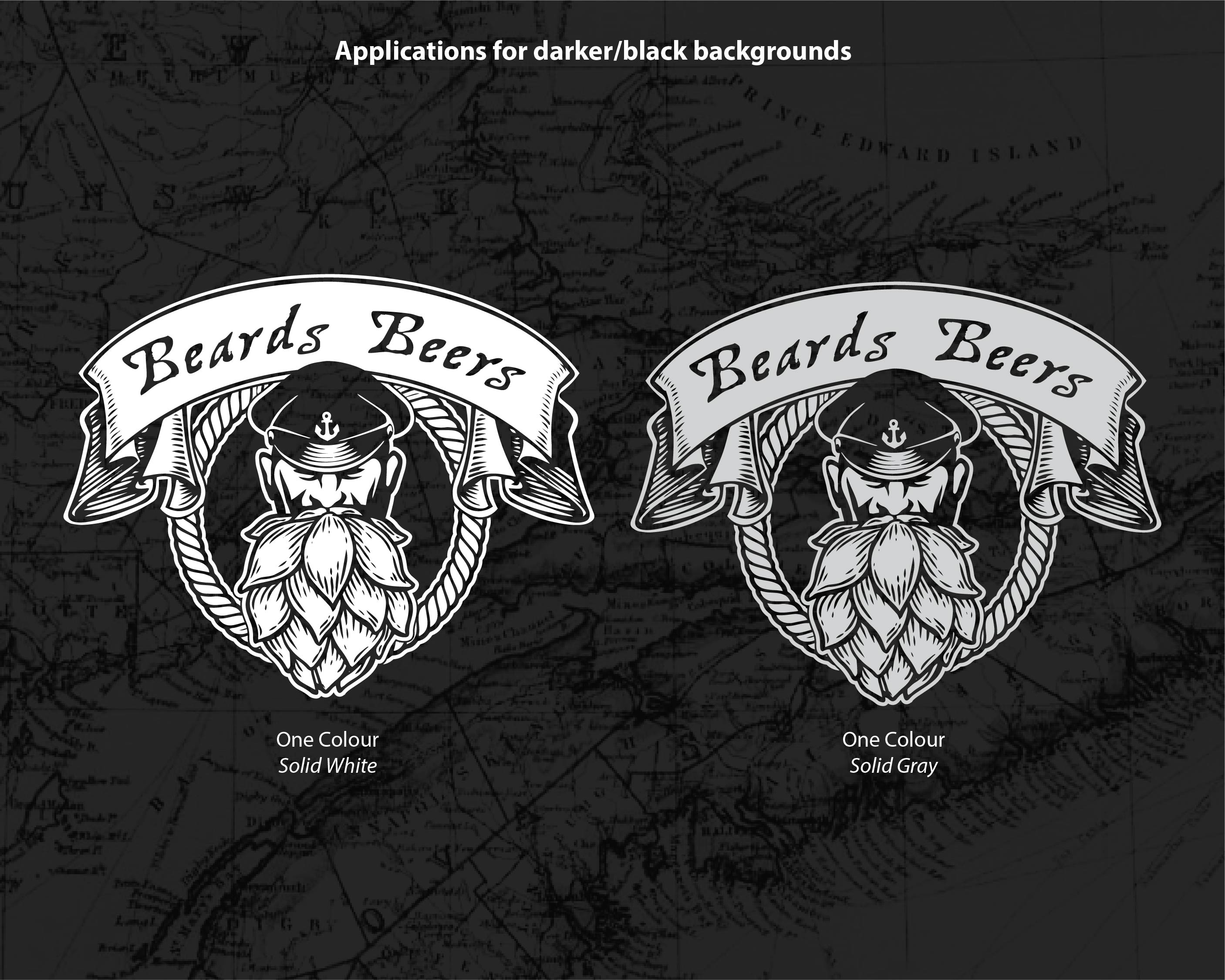
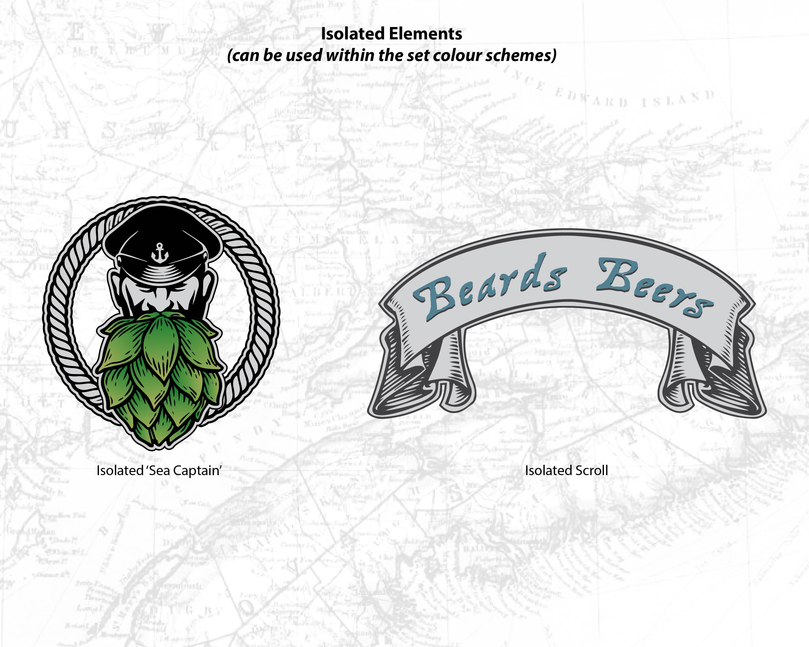
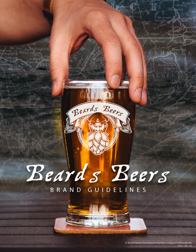
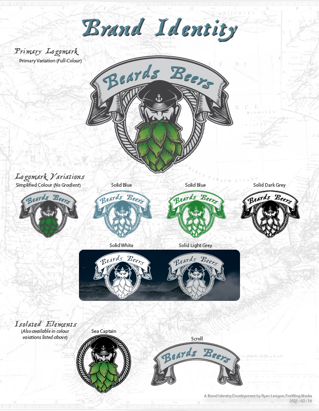
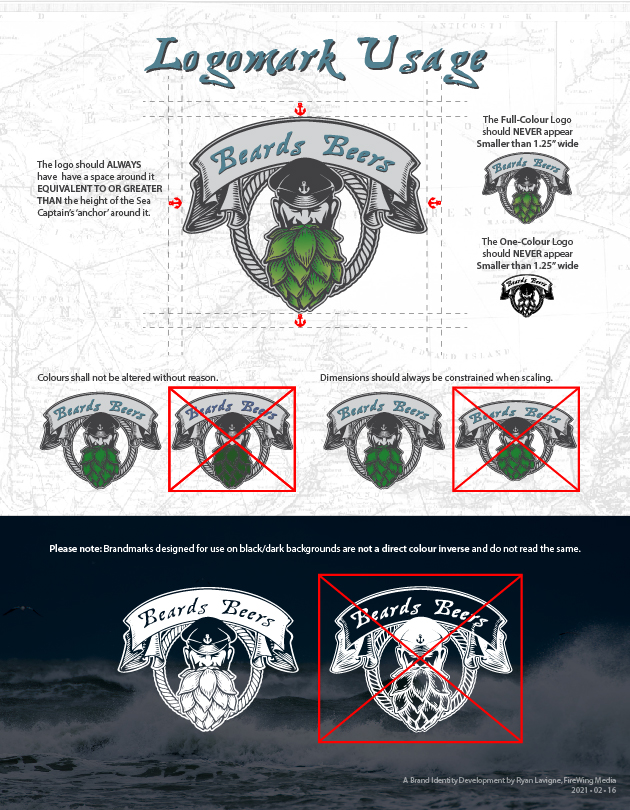
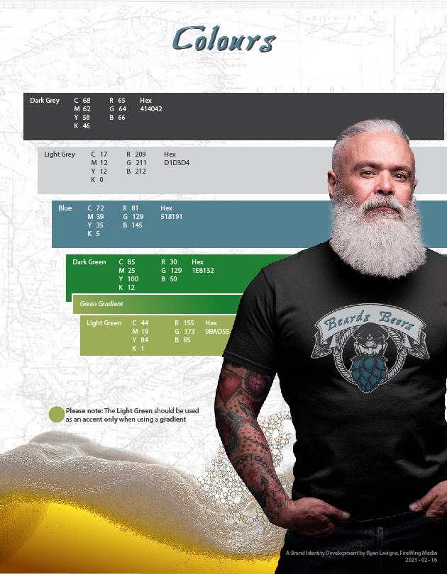
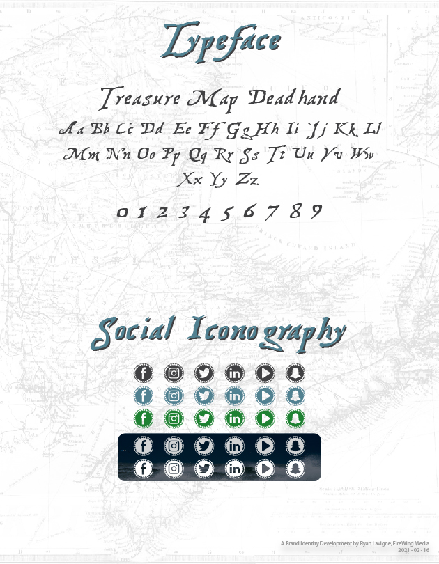
A few small tweaks later and we landed on what would be the final version of the Beards Beers identity. With a dedicated logomark, colour palette and typeface we developed a few supporting graphics and a full Brand Guidelines document to ensure consistency across all platforms and applications as the brand grows.
What are your thoughts? We’re pretty thrilled with the end result!

